Seaborn is built on Matplotlib and specializes in statistical data visualization. It has a unique style and is a powerful Python visualization package. In Excel’s built-in Python, Seaborn is pre-imported (alias sns).
Box Plots
Box plots show the distribution of numerical data and help identify outliers (values beyond 1.5×IQR from Q1/Q3). Use boxplot() to draw box plots.
In the worksheet shown in Figure 7-21, cell F1 (Python mode) inputs code to draw a box plot of employee salary data (columns A-E):
df = xl("$A$1:$E$101", headers=True)
sns.boxplot(df, x='Education', y='Salary', hue='Gender')  # Group by Education and Gender
plt.xticks(fontsize=16)
plt.yticks(fontsize=16)
plt.legend(fontsize=16)
plt.xlabel('Education', fontsize=16)
plt.ylabel('Salary', fontsize=16)
Press Ctrl+Enter to return an Image object. Merge cell range G1:K14 to display the result (top plot in Figure 7-21).
A horizontal box plot can be drawn by swapping x and y:
df = xl("$A$1:$E$101", headers=True)
sns.boxplot(df, x='Salary', y='Education', hue='Gender')
plt.xticks(fontsize=16)
plt.yticks(fontsize=16)
plt.legend(fontsize=16)
plt.xlabel('Salary', fontsize=16)
plt.ylabel('Education', fontsize=16)
Press Ctrl+Enter to return an Image object. Merge cell range G15:K27 to display the result (bottom plot in Figure 7-21).
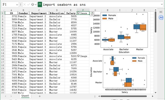
Figure 7-21
Violin Plots
Violin plots combine box plots and kernel density curves. The black rectangle shows Q1–Q3 and the median; the curve shows the density distribution. Use violinplot() to draw violin plots.
In the worksheet shown in Figure 7-22, cell F1 (Python mode) inputs code to draw a violin plot:
df = xl("$A$1:$E$101", headers=True)
sns.violinplot(df, x='Education', y='Salary', hue='Gender')
plt.xticks(fontsize=16)
plt.yticks(fontsize=16)
plt.legend(fontsize=16)
plt.xlabel('Education', fontsize=16)
plt.ylabel('Salary', fontsize=16)
Press Ctrl+Enter to return an Image object. Merge cell range G1:K14 to display the result (top plot in Figure 7-22).
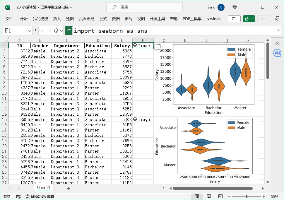
Figure 7-22
A horizontal violin plot is drawn by swapping x and y:
df = xl("$A$1:$E$101", headers=True)
sns.violinplot(df, x='Salary', y='Education', hue='Gender')
plt.xticks(fontsize=16)
plt.yticks(fontsize=16)
plt.legend(fontsize=16)
plt.xlabel('Salary', fontsize=16)
plt.ylabel('Education', fontsize=16)
Press Ctrl+Enter to return an Image object. Merge cell range G15:K27 to display the result (bottom plot in Figure 7-22).
Pair Plots
Pair plots show relationships between multiple variables (scatter plots for pairs, density/histograms for diagonals). Use pairplot() to draw pair plots.
In the worksheet shown in Figure 7-23, cell E1 (Python mode) inputs code to draw a grouped pair plot (hue = Cylinders):
df = xl("A1:D407", headers=True)
sns.pairplot(df, hue='Cylinders')  # Color by Cylinders
sns.set(font_scale=1.8)  # Increase font size
Press Ctrl+Enter to return an Image object. Merge cell range F1:J14 to display the result (first plot in Figure 7-23).
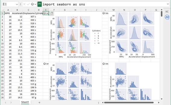
Figure 7-23
For ungrouped data (columns A-C), cell E16 (Python mode) inputs:
df = xl("A1:C407", headers=True)
sns.pairplot(df)
sns.set(font_scale=1.8)
Press Ctrl+Enter to return an Image object. Merge cell range F16:I28 to display the result (second plot in Figure 7-23; diagonal shows histograms).
To draw kernel density plots (instead of scatter plots), set kind='kde':
df = xl("$A$1:$C$407", headers=True)
sns.pairplot(df, kind='kde')
sns.set(font_scale=1.8)
Press Ctrl+Enter to return an Image object. Merge cell range M1:Q14 to display the result (third plot in Figure 7-23).
To draw only the lower triangle of the pair plot, set corner=True:
df = xl("$A$1:$C$407", headers=True)
sns.pairplot(df, corner=True)
sns.set(font_scale=1.8)
Press Ctrl+Enter to return an Image object. Merge cell range M16:Q28 to display the result (fourth plot in Figure 7-23).
Joint Plots
Joint plots show a scatter plot with marginal distributions (histograms or density curves) on the top and right. Use jointplot() to draw joint plots.
In the worksheet shown in Figure 7-24, cell D2 (Python mode) inputs code for a joint plot (univariate marginals):
df = xl("A1:C407", headers=True)
sns.jointplot(df, x='MPG', y='Acceleration')
plt.xticks(fontsize=16)
plt.yticks(fontsize=16)
plt.xlabel('MPG', fontsize=16)
plt.ylabel('Acceleration', fontsize=16)
Press Ctrl+Enter to return an Image object. Merge cell range E2:I15 to display the result (left plot in Figure 7-24).

Figure 7-24
For grouped data (hue = Cylinders), cell L2 (Python mode) inputs:
df = xl("A1:C407", headers=True)
sns.jointplot(df, x='MPG', y='Acceleration', hue='Cylinders')
plt.xticks(fontsize=16)
plt.yticks(fontsize=16)
plt.legend(fontsize=16)
plt.xlabel('MPG', fontsize=16)
plt.ylabel('Acceleration', fontsize=16)
Press Ctrl+Enter to return an Image object. Merge cell range L2:P15 to display the result (right plot in Figure 7-24; marginal density curves for each group).